CASE STUDY
JFK Terminal 4
Escort Authorization Portal
Overview
My Role
As a UX/UI Designer at Ronik Design Agency, I worked with JFK Terminal 4 (client) for this project.
Designed 40+ screen iterations
Created a 50+ Figma component system
Iterated through 3 review rounds with client
Team
1 UX/UI Designer (Me!)
1 UX/UI Designer/Developer
1 Senior Web Developer
1 Project Manager
1 Creative Director
Tools
Design - Figma, Miro
Development - PHP, JavaScript, CSS, WordPress
Duration
October - November 2024 (2 Months)
Launched December 2024 🚀
PREVIEW
This dashboard is fully functional and in-use at JFK Terminal 4 since December 2024! 🥳
This software is for internal use only, but you can watch the demo video below.
A screen recording of the developed product being demoed.
The final design for the JFK Terminal 4 Escort Authorization Portal.
Problem
About JFK Terminal 4
T4 is the largest terminal at New York's John F. Kennedy International Airport (JFKT4). It's over 2 million square feet, home to 22 airlines, has 12,000+ employees, and serves 25+ million passengers each year.

An outside view of JFK Terminal 4 (click on images to enlarge them).
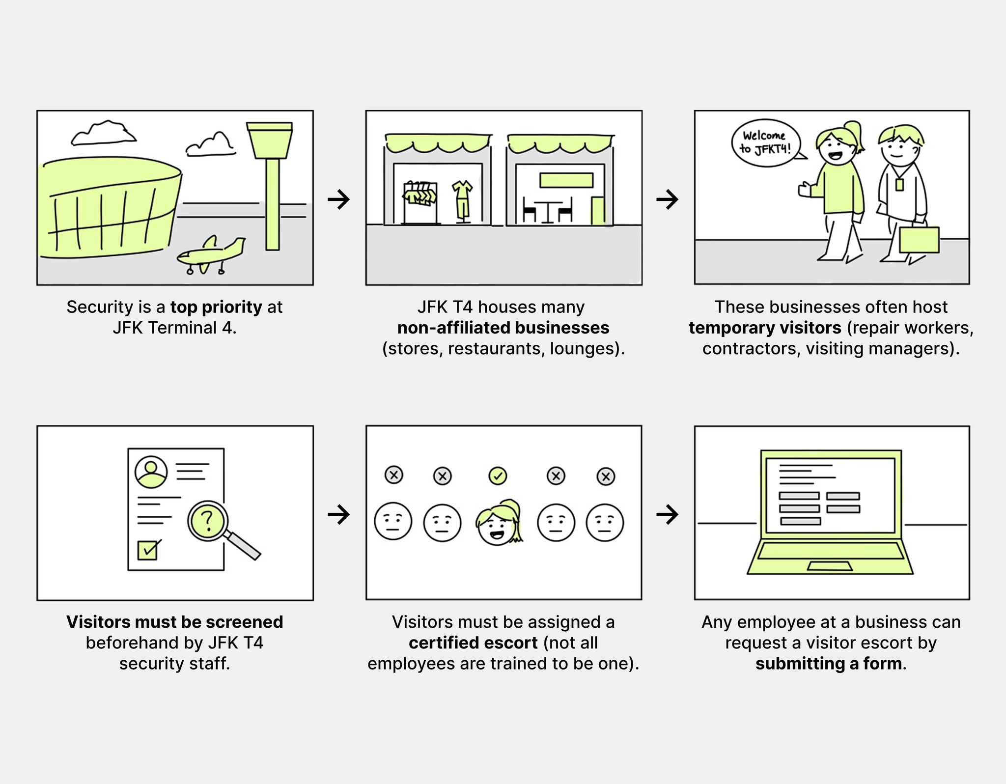
Storyboard (Part 1)
The JFK T4 security protocol and how the original visitor escort request process was like.
The original form used in the security process.
The form asks for…
ID verification
Visit details confirmation (requesting business, visit reason, location, time)
Who will be conducting the escort (and their information)
After submission, all updates (approval or rejection status) are sent via email. Specific details like access location and badge number are given on the day of the visit.
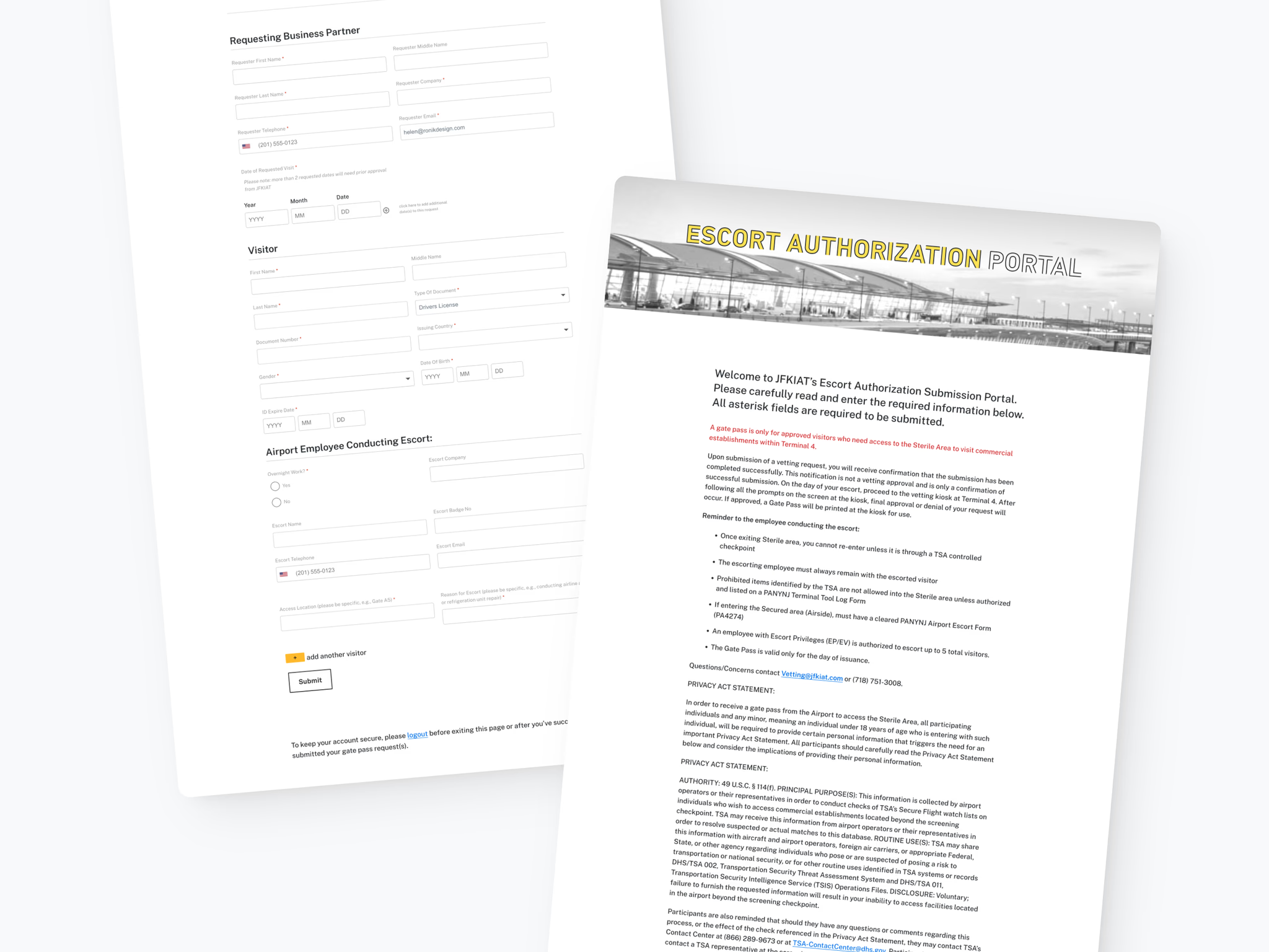
The original escort authorization request form (split into the top and bottom halves of the page).
Storyboard (Part 2)
Problems with the original visitor escort request system.

PROBLEM
JFK Terminal 4 lacked a streamlined system to view, track, and submit visitor escort requests.
Pain Points
Lots of repetitive information to scroll past each time
Employees must continuously check their email for updates
Employees don’t know why a requests gets rejected
Employees would accidentally submit the same requests
No easy or quick way to check the status of all your submitted requests
No place to add features/pages to the Escort Authorization Portal in the future
This led to confusion, inefficiencies, and delays, making it difficult for employees to manage visitor access.
Key Issues
Lack of visibility: Employees lost track of request statuses in cluttered inboxes
Repetitive work: Employees often resubmitted the same request unknowingly
No transparency: There was no rejection reason, making corrections difficult
Cumbersome process: There was no centralized hub for tracking
Solution
SOLUTION
An all-in-one digital dashboard to easily view, track statuses of, and submit visitor escort requests.
To streamline this manual, email-based process, we created a digital dashboard solution for submitting and managing security-approved gate pass requests.
This dashboard includes…
Accordion-style rows
Announcements
Search and filter
Information page
Account page
Key Features + Impact
Centralized requests for easy status tracking (pending, approved, or rejected)
Displays full request details (visitor info, escort, visit date, etc.)
Search & filtering functionality for quick access to requests
Providing clear rejection reasons to simplify resubmissions
Directly impacts 12,000+ employees and handles 7,000+ requests per month
FEATURE #1
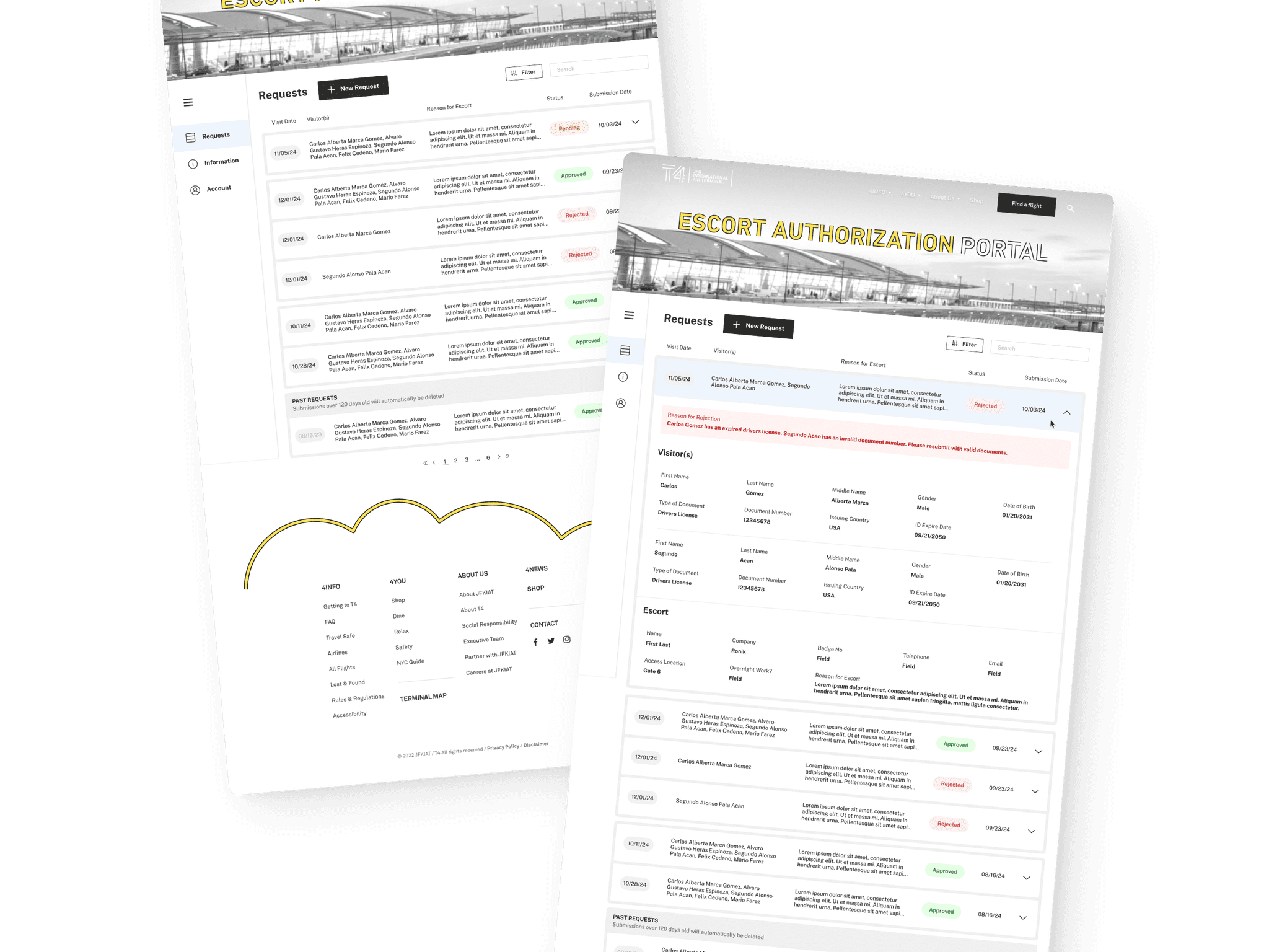
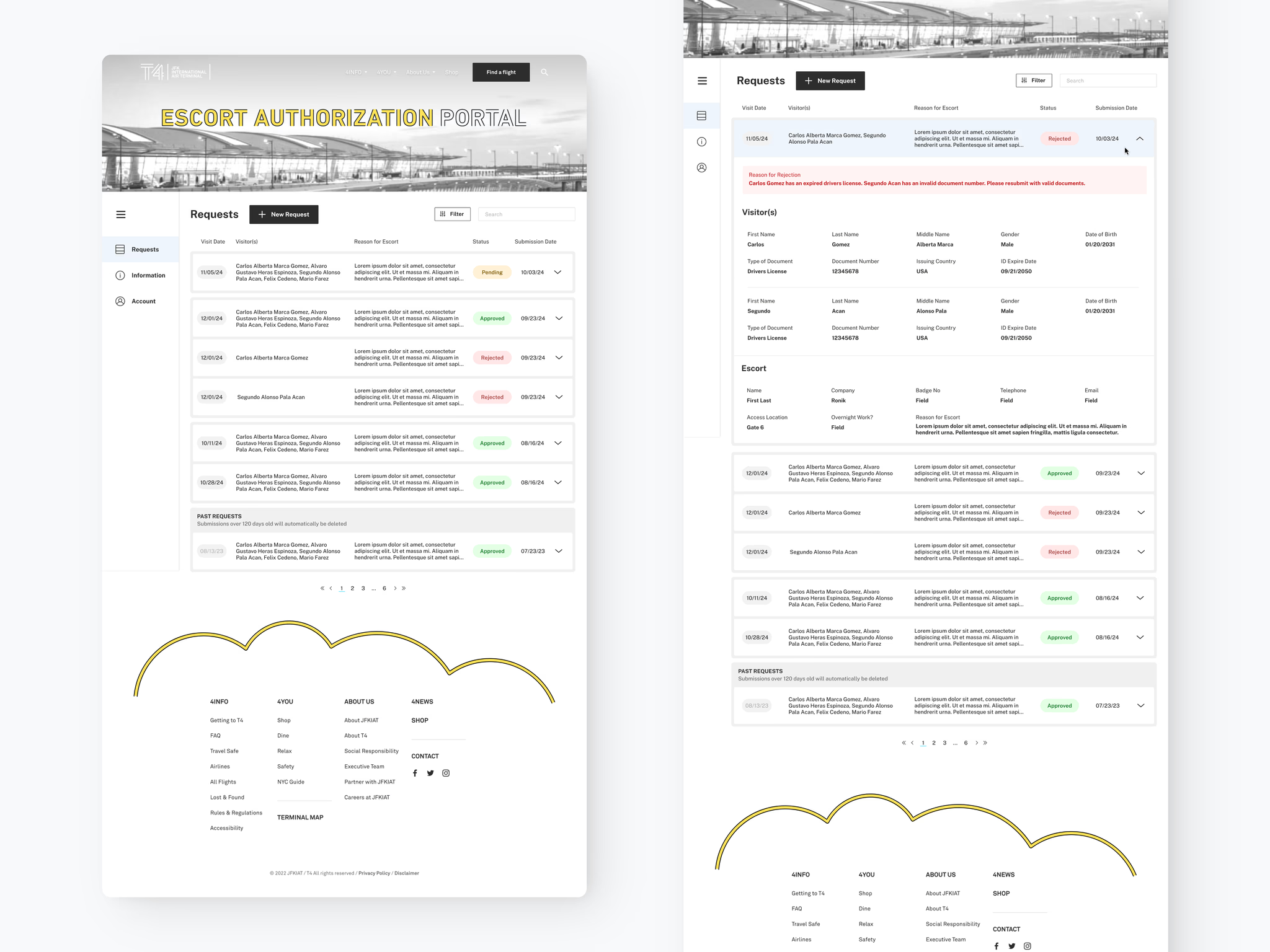
Track all requests at a glance.
All requests from the past 120 days are saved and easily accessible in the dashboard. Requests where the visit date has already happened are put into the “Past Requests” section, which features a grayed out visit date tag and a hover indicator.
Quick access to the most important information:
Visit Date
Visitor(s)
Reason for Escort
Status (Pending, Approved, Rejected)
Submission Date

Desktop dashboard, with the side navigation expanded.
FEATURE #2
Easily share announcements to all employees.
Escort Authorization Portal admins are able to set a non-dismissable announcement for important messages right on the dashboard home page.

Desktop dashboard, with the side navigation minimized + announcement message.

Mobile dashboard, with announcement message.
FEATURE #3
Expand requests for full details.
All requests open accordion-style, showing all details for each visitor and the escort itself.
This is useful for...
Confirming visitor and escort details
Checking is a request has already been submitted
Checking the rejection reason, allowing users to fix their mistakes and resubmit

Desktop dashboard, with accordion open.

Desktop dashboard, with accordion open + rejection reason.

Mobile dashboard with accordion open + rejection reason.
FEATURE #4
Quickly search and filter for requests.
Find what you need faster with filtering for status, visit date, and submission date. The search bar can find specific terms, like names of visitors.

Desktop filter modal designs.

Desktop filter modal, with “Status” selected to “Pending” only.

Desktop dashboard, with filters applied.

Mobile dashboard filter modal + filters applied.
FEATURE #5
A new organized place for information.
A new separate page for information was created, organizing the content into sections with a side navigation bar for easy access.
The wall of text that used to live at the top of the submission form was moved here, as well as submission guidelines, and privacy statements.
This new page improves scalability by offering a place for new information in the future. For example, we added a new frequently asked questions (FAQ) section, which was a long-desired feature that didn't exist since there was no location to put it.

Desktop information page, with a side bar for navigation.

Mobile information page, with quick links + FAQ.
FEATURE #6
View your information, all in one place.
Easily access your account details in a dedicated page.

Desktop account page.

Mobile account page.
OTHER SCREENS
Miscellaneous screens that are part of the final product too!

Desktop dashboard, loading + empty states.
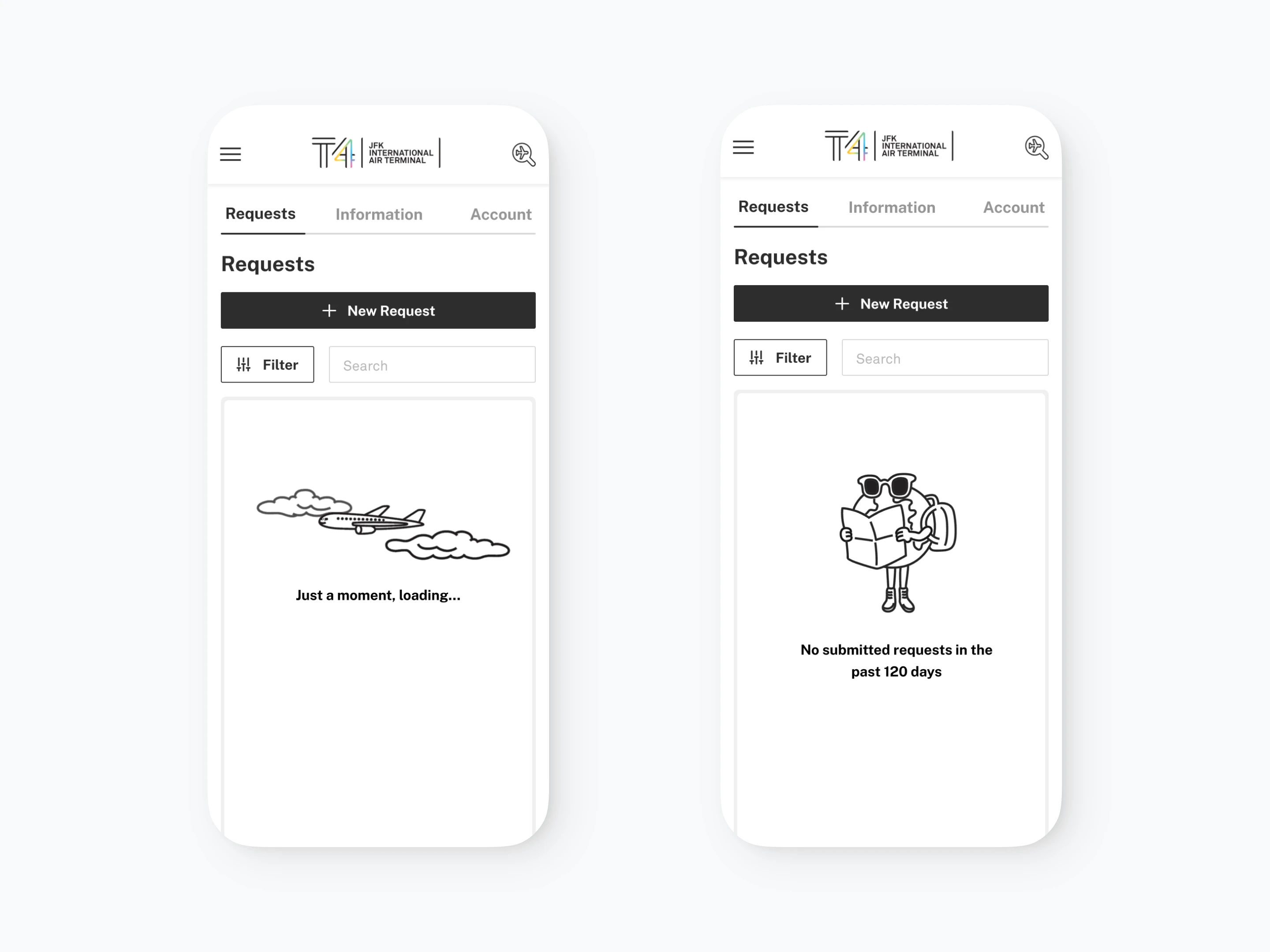
Mobile dashboard loading + empty state screens.
Process
BACKGROUND
About JFK T4
T4 is the largest terminal at New York's John F. Kennedy International Airport (JFKT4). It's over 2 million square feet, home to 22 airlines, has 12,000+ employees, and serves 25+ million passengers each year.
An outside view of JFK Terminal 4.
About Ronik Design
Ronik is an award-winning full-service digital creative agency based in NYC.
JFKT4 has been a longtime client of Ronik ever since the company designed, developed, and now maintains their digital experiences (e.g. website, touch-screen directory kiosks, digital signage, and internal software tools).
During my time at Ronik, I worked as one of two UX/UI Designers to improve their security vetting request process.

Some of the previous work Ronik Design has done for JFK Terminal 4.
RESEARCH
Understanding the problem: security challenges
With so many non-T4-affiliated employees (such as those working for businesses inside the terminal), it is difficult to securely verify visitor access. As a result, a vetting system was established, requiring all visitors to:
Verify their identity (via legal documents)
Confirm their visit details with the requesting business (reason, location, time)
Be assigned an escort
Receive an access location and badge number
An inefficient system
The existing process relied on businesses submitting requests through a form (known as the Escort Authorization Portal), which were then reviewed by the security department. Updates on approvals or rejections were sent via email.
However, this system created frustrations for employees, who had to sift through email chains to track requests. With thousands of requests processed monthly, it was easy to lose track of approvals, pending requests, or rejections that required resubmission.

Original security vetting request form.
THE PROBLEM
JFK Terminal 4 lacked a streamlined system to view, track, and submit visitor escort requests.
Understanding use cases
Employees must fill out the form to have a visitor approved
Each form submission can have up to 5 visitors
Each form submission can have multiple visit dates
Employees often have many pending form submissions at the same time
Employees often fill out the forms in bulk
Rejected requests must be fixed and resubmitted
A request with several visitors may result in multiple different visitor statuses
All request updates are sent via email
Pain points
Lots of repetitive information to scroll past each time
Employees must continuously check their email for updates
Employees don’t know why a requests gets rejected
Employees would accidentally submit the same requests
No easy or quick way to check the status of all your submitted requests
No place to add features/pages to the Escort Authorization Portal in the future
This led to confusion, inefficiencies, and delays, making it difficult for employees to manage visitor access.
Key Issues
Lack of visibility: Employees lost track of request statuses in cluttered inboxes
Repetitive work: Employees often resubmitted the same request unknowingly
No transparency: There was no rejection reason, making corrections difficult
Cumbersome process: There was no centralized hub for tracking
PROJECT SCOPE
Working with the client
Thanks to the longstanding relationship with this client, there was already a lot of mutual trust and openness to Ronik’s ideas for a solution. We proposed an all-in-one dashboard for users to log into and be able to access the submission form, view their pending and past requests, and access additional information (e.g. reminders, privacy statements, FAQ).
SOLUTION
An all-in-one digital dashboard to easily view, track statuses of, and submit visitor escort requests.
We then worked with the client to outline specific requirements for the project that matched their needs, budget, and timeline.
Design Specification Requirements
Styled/branded and intuitively designed dashboard for business vendors, initial landing on successful login
Displays user’s submissions no older than 120 days
Sort and filter features according to fields: Request status, Visitor name, Reason for visit, Submission date, Request date
Submissions expandable by accordion within a single dashboard page
Displays Visitor and other field info, account details, terminal info, etc.
EXPLORATION AND ITERATION
Sketching possible layouts with wireframes
After determining the requirements for the project and settling on a digital dashboard solution, I sketched out different possible layouts to guide my digital designs.

Component system in Figma for tags and buttons.
Utilizing components and auto-layout in Figma to efficiently explore and iterate on designs.
Created a component system where I could quickly make a new variant of a UI element and apply it to a premade page. This also allowed quick layout changes (e.g. dragging in different rows and section dividers into the table).

Component system in Figma for tags and buttons.

Component system in Figma for the dashboard table.
Finding the right balance of simplicity and information in the dashboard table design.
Explored ordering of columns
Iterated on row styles (e.g. strokes, pajama stripes style)
Iterated on tag styles (for visit dates and status)
Explored selected state colors
Explored ordering and grouping of rows

Different explorations of the dashboard design (click to enlarge image).
A new problem comes up:
How do you indicate only some visitors in a request were rejected?
Form submission requests can have multiple visitors, but there are many scenarios when the status of different visitors vary in one request. For example, every visitor may be approved accept for one person.

Different explorations of varying statuses of the visitors from the same request (click to enlarge image).
Iterating on full requests details.
Created a component system where I could quickly make a new variant of a UI element and apply it to a premade page. This also allowed quick layout changes (e.g. dragging in different rows and section dividers into the table).
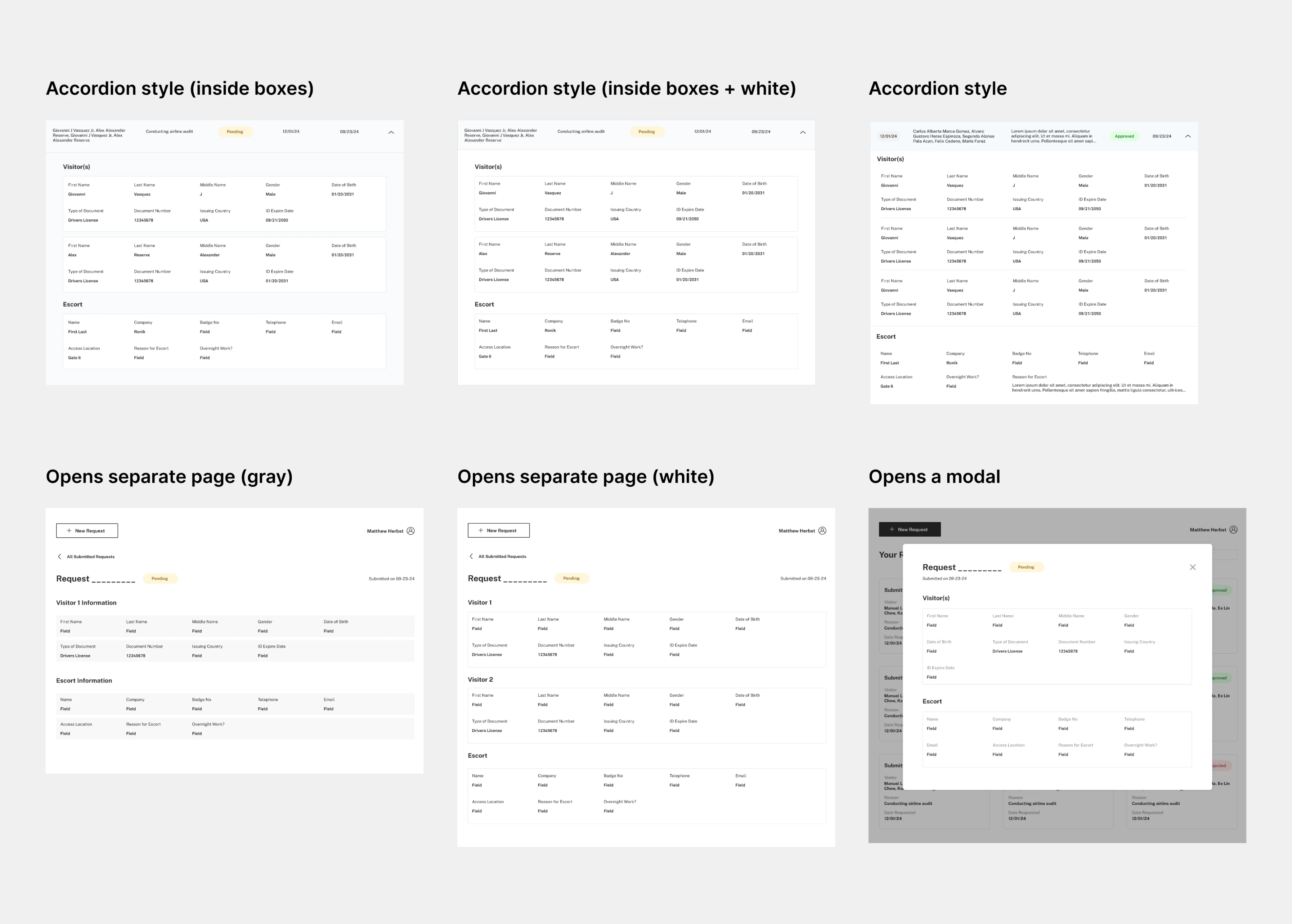
Different iterations of displaying full request details (click to enlarge image).
Simple is better.
After pitching several directions to the client and highlighting the strengths and trade-offs of each version, we decided to go with the minimalistic accordion style.
Because the dashboard has so much content, we wanted to reduce the amount of visual clutter, hence the removal of excess boxes, icons, and complex visitor status indicators.
Visitors from the same request that have different statuses (for example, if everyone in a request gets approved except for one person) are separated into different rows that are still visually grouped together.
This design was chosen after getting feedback from users who prefer to keep visitors from the same request grouped together, but still wanted a minimalistic clean UI.
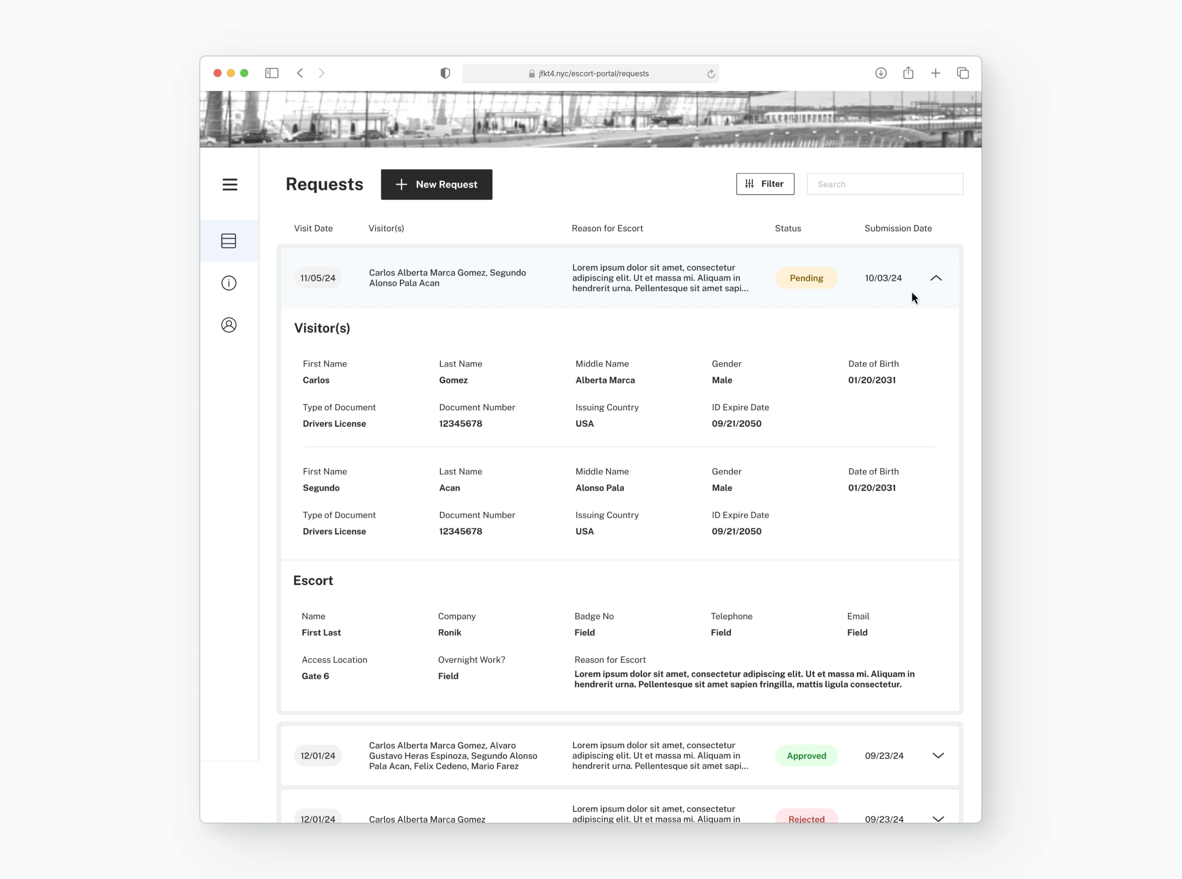
Final desktop dashboard design, with accordion open.
Design to Development Handoff
FINAL DESIGNS
Images of all the finalized designs
Scroll to the “Solution” section for additional information on finalized designs.

Final desktop dashboard designs.

Desktop dashboard, with the side navigation expanded.
Desktop dashboard, with the side navigation minimized + announcement message.

Mobile dashboard, with announcement message.
Desktop dashboard, with accordion open.
Desktop dashboard, with accordion open + rejection reason.
Mobile dashboard with accordion open + rejection reason.
Desktop filter modal, with “Status” selected to “Pending” only.
Desktop dashboard, with filters applied.
Mobile dashboard filter modal + filters applied.
Desktop information page, with a side bar for navigation.
Mobile information page, with quick links + FAQ.
Desktop dashboard, loading + empty states.
Desktop account page.

Mobile dashboard loading + empty state + account page screens.
DEVELOPMENT AND DEMO
Communicating with developers 💬
During the design process we often communicated with the developers to ensure all aspects of the design were feasible and realistic given our resources and timeline.
Understanding the back-end also helped inform our design choices and allowed development to start before designs were finalized, which helped greatly with meeting the 2 month timeline for the project.
Luckily, one of the developers was also a designer, which helped ensure a smooth handoff from design to development!
This dashboard is fully functional and in-use at JFK Terminal 4 since December 2024! 🥳
This software is for internal use only, but you can watch the demo video below.
A screen recording of the developed product being demoed.
Reflection
LEARNINGS AND GROWTH
The power of iteration and exploration 🔁
I learned firsthand that exploring multiple design directions early on is crucial for uncovering the best solutions, rather than settling on what comes to mind first. By generating a wide range of ideas, I was able to push creativity, identify what resonated most with stakeholders, and refine the final design based on thoughtful iteration.
Collaborating efficiently with others 🤝
Due to the high level of collaboration and frequent critique sessions, I learned to adopt more efficient ways of organizing design files—clearly indicating who worked on what, version history, and structured iterations. I also incorporated more auto-layout, reusable components, and tools like html.to.design to improve efficiency and scalability.
Communicating and presenting your design 💬
I strengthened my ability to present and justify design decisions by clearly explaining the strengths and trade-offs of different design directions. A key part of being a designer is tailoring presentations to the audience—who are often not designers. By walking clients through multiple options and gathering direct feedback, I was able to refine the final design to better align with their goals while maintaining a strong user experience.
Thanks for reading!
Let me know if you have any questions or feedback for this case study :)