Elemental Cosmetics
BRANDING, GRAPHIC DESIGN, TYPOGRAPHY, PACKAGE DESIGN, MARKETING
MY WORK
In this design portfolio piece, I showcase the branding campaign I created for Elemental Cosmetics, a new cosmetics brand that specializes in sparkled lotions. The goal of the project was to create a cohesive brand identity that would appeal to the target audience and differentiate the brand from competitors.
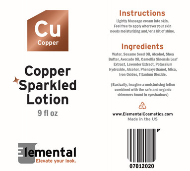
The branding campaign includes various designs such as a logo, advertisements, product packaging and rendering, and mock-ups, which were all created with a consistent visual language inspired by chemistry and science.
TEAM
Solo Project
WHEN
May 2021
TOOLS
Illustrator
Dimension
Photoshop

RESEARCH + BRAINSTORMING
I began by researching current trends in the cosmetics industry and analyzing the target audience. I found that there was an opportunity to create a unique brand identity that would appeal to a more scientific demographic. This demographic has been targeted by some high end skincare brands, such as the brand Dr. Barbara Sturm, but none have broken into the mainstream with a more cosmetic-focused brand.
The positives of such a cosmetics brand include being able to appeal to audiences that want to enhance their look with products that simultaneously improve their skin health. The chemistry and science inspired brand aesthetic help further convey and validate the brand's science-backed skincare formulas. I drew inspiration from the periodic table and chemistry to create a brand identity that was both whimsical and sophisticated.

BRANDING + FINAL PRODUCT
The final result is a cohesive and distinctive branding campaign that effectively communicates the brand's unique identity, making it stand out in the cosmetics industry. I used a color palette inspired by the colors of the elements in the periodic table, along with graphic elements like laboratory equipment to create a distinctive and memorable visual identity. The variations of different colored sparkled lotions are named after the elements they look like, such as gold, silver, and copper. The logo contains an "E" in a lab beaker where the arms of the "E" make up the measurement lines.
After designing the branding, logo, and packaging, I created product renders using Adobe Dimension and used them in a couple of advertisement designs, using the slogan "elevate your look."


